About
The State of Hawaii, Office of Enterprise Technology Services (ETS) (previously the Office of Information Management & Technology (OIMT)) developed this web style guide in collaboration with Hawaii Information Consortium (Tyler Hawaii) through an RCUH solicitation, RFP 2012-008. The web style guide, along with the state web template, are part of ETS’s efforts to establish a consistent look and feel for the State of Hawaii’s official websites that incorporate the latest web design & technologies.
Philosophy & Approach

Our design philosophy is to COPE – Create Once, Publish Everywhere. By providing a comprehensive template & style guide, the State of Hawaii can provide a consistent look and feel across all the government websites. We can use the best new web technologies and create streamlined websites that helps citizens find what they’re looking for, efficiently and intuitively.
Web Today
Meeting the needs of today’s web users requires a mobile-sensitive mindset. We must accept that content can and should have a unique look & feel on different browsers.
We must shift focus back to the content and end user. Responsive web design with a mobile first approach helps to provide the best user-centric web experiences.
Responsive Web Design

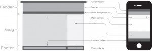
In Responsive web design, page content will adapt to look good and work well on a vast range of devices. This is accomplished using HTML5, CSS3 and JavaScript. Media queries allow the browser to receive different stylesheets depending on the viewport (browser window) width. Flexible grids and fluid media allow the website and its content to be device agnostic. JavaScript shims called polyfills and JavaScript libraries are used to backfill functionality in older browsers.
Mobile First Approach

To do responsive web design, we must have a mobile first mindset and focus on content first. In mobile first, web planners & designers start with the small display sizes and progressively enhance outward. The mobile first approach encourages everyone who’s involved in the creation & growth of a website to think about content first – this leads to clean layouts, concise writing, and more intuitive web interfaces.

