Template
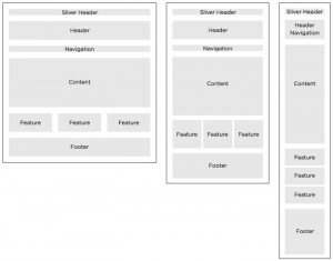
This style guide uses the state website template. The template has three page layouts: home, sidebar (default), and a full-width page. The template has sections and elements that will be common for all state agencies. The sections that will remain throughout all sites include:
- Header: sliver header, logos, site title, and search [optional header elements are the social media links]
- Navigation: horizontal
- Content: main content [rotating panel (home page), optional sidebar area, featured content teasers]
- Footer: same site-wide
- Background image: same site-wide
Header
Each agency header is comprised of the following elements:
- State sliver header (includes the Hawaii state portal link, text resizer, and stay connected link)
- Main header (includes the state seal and agency logo & name, site search, and if applicable, the social media icons)
- Statewide sliver is placed at the top of the header of all pages and is rendered using the header.php within the template.
- Agency logo should be 225 pixels x 71 pixels, and either an official state seal or emblem, or agency / municipality logo. This element’s ratio can be changed in the template files.
- Backgrounds should be able to pass a contrast test. An easy way to conform to this design guide is to either have no background or make it a shade of grey no darker than 10%.
Navigation
The main navigation should only have main site categories. Nothing else should be listed here. Linking to PDF’s or off site links should be reserved for the main content area. The main reason for this is that it breaks the user experience, it is not 508 compliant and it hurts search engine optimization.
To edit all site menus, go to Appearance > Menus.
The navigation color scheme can be customized within the style.css.
- If you use sub-navigation, your parent page will have content that will not be accessible. This is because sub navigation is accessed when clicked and not on mouse hover. The reason for this is to stay 508 compliant and hovering does not work on touch screen devices. This should be thought of when organizing your online content.
- Color schemes should be vetted by a web designer or not changed at all and defaulted to the blue scheme.
- The main menu links are taken from the page titles. Page titles should not be excessive in length and be as concise as possible. The template looks best and is a better user experience when the main navigation is kept to one line. Consider using a sidebar menu to supplement your menu.
Content
SLIDER (ROTATING BANNER) (home page only)
The slider will only show on the home page. It is comprised of a featured image, an excerpt, and the page title. To edit, go to Appearance > Theme Options > Home Page > Slider. By default, it is limited to featured pages, but can be alternatively set to a post category.
- The images must be 630 pixels × 200 pixels. This can be changed by editing the featured image php file. If the layout needs calls for the rotating banner to be the entire width, it can be changed there. The excerpts and page titles might need to be edited in the style.css to allow for this.
- Preview any changes to make sure the excerpt is not covering a person’s face.
FEATURED BUTTONS (home page only)
These are controlled by going to Appearance > Theme Options > Home Page > Featured Buttons. The buttons consist of an icon image and a link. By default, there needs to be three buttons to line up with the rotating banner.
- Use an icon image that is 30 pixels x 30 pixels, transparent and based off of entypo icon set.
ALERTS (home page only)
Alerts display information from the announcer plugin. These are controlled by going to the WordPress admin and selecting Announcer from the left-hand menu.
- Use simple text and only use this feature for important information that is time sensitive. Also, if a user chooses to close the announcer box, it will not show up again until a new announcement.
MAIN CONTENT
The content in this area can be changed by editing the main text box on home page in the admin.
- Use the 12 column grid system to layout sections.
- Keep formatting simple
Featured Sections
These are controlled by the meta boxes at the bottom of the Home page edit screen in the admin. They consist of a title, an image, a small description and a link.
- Keep titles concise
- Choose images that relate to the linked content
- Size the images to be 295px wide
Footer
The footer section will be on every page. The footer can have some additional links and contact information. These items can be edited in the footer.php (advanced).


